Thursday, December 13, 2012

Los Angeles Station Fire 2009


           In late August of 2009 a large fire burned through around 160,000 acres of chaparral and forest land in Angeles National Forest. Called the Station Fire, more than 2,800 firefighters, 12 helicopters, and 8 air tanks have joined forces to battle the fire as it spread across the county. Though there was not much wind, the dry conditions helped fuel the fire, making it difficult to contain. The fire extended from the edge of metropolitan Los Angeles down towards the Mojave Desert, forcing 6,600 evacuations and threatening roughly 12,500 homes.
             The Station Fire had led to air quality officials issuing smoke advisories due to really low air quality caused by the smoke. Most of the pollution was concentrated in the valleys with a recorded Air Quality Index of 398 as reported by the Los Angeles Times. Officials have stated that any number above 100 is considered unhealthy. The low air quality had caused several districts to close their schools or postpone their first day back, including Glendale, Los Angeles, Pasadena, and La Canada.
            Based on the maps provided, though some schools were close to the fire, none were in its direct path. This is most likely due to how the city was planned out. According to the California Chaparral Institute, wildfires in the chaparral area are common and expected. For this reason, city planners made sure that no schools were within close range. In addition, all public and private schools go through an annual fire safety inspection in order to ensure that fires do not start on the individual campuses.
The reason schools were impacted this time was due to the drought conditions which led to a bigger, more unpredictable fire. Though the fact that fires occur may be predictable, the rest of the environment is not, which makes it difficult to assess what is the best way to control the fire. In addition, according to USGS, as reported by the California Chaparral Institute, “there are more than 140 miles of fuel breaks within the Station Fire Perimeter. Many of these areas have been invaded by highly flammable, non-native weeds” (Syphard). The Institute argues that rather than trying to clear the area of its native vegetation, scientists should look into seeing what else is growing within the region and the impact of the non-native greenery.
However, due to city planning none of the schools were severely damaged and were able to open back up once the air quality improved. Also, judging from the provided maps, other than one, almost all the highways were also away from the fire. Even as the fire spread, it did not reach the main part of Glendale. This demonstrates the importance of city planning, especially around areas prone to natural disasters. Many reports regarding damaged houses and injured citizens claim that they failed to follow regulations and/or refused to evacuate when ordered to do so. Wildfires are inevitable in Southern California, but as long as precautions are taken beforehand, their damage can be limited. 

Works Cited
"53 Structures Burned in Station Fire." Los Angeles News. KABC 7, 31 Aug. 2009. Web. 4 Dec. 2012.

"Department of City Planning." Department of City Planning. City of Los Angeles, 2010. Web. 4 Dec. 
         2012. 

Garrison, Jessica. "Station Fire Claims 18 Homes and Two Firefighters." Los Angeles Times. Los Angeles 
          Times, 31 Aug. 2009. Web. 4 Dec. 2012. 

 Knoll, Corina. "Air Quality Suffers, Schools Stay Closed and Animals Find Shelter." Los Angeles 
           Times.   Los Angeles Times, 31 Aug. 2009. Web. 4 Dec. 2012.

"Local News." Daily News Los Angeles. Daily News, 30 Aug. 2009. Web. 13 Dec. 2012


Syphard, A. D. "California Chaparral Institute." Misconceptions about the Station Fire 
             Corrected. California Chaparral Institute, 04 September 2009. Web. 4 Dec. 2012.


Wednesday, November 21, 2012

U.S POPULATION DATA

           This map illustrates the population in each county. The darker the shade of purple, the more people live in a given county. Contrastingly, the lighter shades of purple indicate areas with a small population. Areas in the Midwest, for the most part, seem to have significantly lower populations than counties along the West Coast and Upper East Coast. Large cities tend to have the largest populations.
           This map shows the percent change in the total population over a decade. The colors gradually change from orange to dark purple. Orange indicates a percent loss, as more people move out of those counties than into them, while dark purple indicates a percent gain as more people move into those counties than out of them. The counties highlighted indicate that places losing people are rural whereas purple counties are cities that people are moving to.
          This map indicates the population density of each county in the year 2000. The colors change from light green to dark blue, from low density to high density. The right half of the country appears to be more dense than the left, which more counties shaded darker green and dark blue. It is interesting to note that the counties become increasingly smaller as you move from the west coast to the east coast. This trend is rooted in history and the westward expansion that took place during the late 1800s and early 1900s.
           This map illustrates the change in population over a decade. It hints at migratory trends: the Midwest seems to have lost significant amounts of its population, as indicated by the bright pink. Meanwhile, the dark green indicates that Southern California, Arizona, and Florida have seen a huge increase in population. It suggests that people moved out of the rural areas and into the more urban places. In addition, this may be due to demographics: as the baby boomers age, more retire and move to states such as Florida.

           Though each map has a different focus, they all lead to similar conclusions. While accurate conclusions cannot be made without more information, the maps demonstrate that the U.S population is heavily concentrated around the coasts while the Midwest is losing portions of its population. The ability to visualize all this data helps convey the information in a much more appealing way, thanks to GIS. GIS maps help relate accurate information without the hassle of long spread sheets. Going through the Excel sheet, with the same information, is very intimidating and GIS helps to make it easier and understandable.

Saturday, November 17, 2012

DEM: Digital Elevation Model


The geographic coordinate system used for this DEM is the NAD83 (the North American Datum 1983). The extent information is: from top to bottom 39.8929°N to 39.3838° and from left to right -105.7889°W to -104.9694°. From the Aspect Model, it can be seen that the area largely faces south or southwest. The rightmost part of the map, however, faces west or northwest. The Shaded Relief Model indicates that the elevation on the DEM decreases as it moves to the east. The Slope Model, which reflects the steepness of a given surface of a DEM, shows that the elevation is relatively low, with the far right ranging from 0 to about 944,113 feet. In some places, however, the elevation reaches, and exceeds, 8,497,016.472 feet. 


Friday, November 9, 2012

MAP PROJECTIONS: Conformal, Equidistant, and Equal Area


The significance, perils and potential of map projections
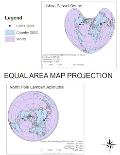
      There are three main forms of map projections-conformal, equidistant, and equal area. Within these three categories there are subtypes of each map, often based on what the map primarily focuses on. A conformal map is generally defined as one that has right angles from where the lines of latitude and longitude intersect. The most common is the Mercator map, as depicted above. An equidistant map is categorized as portraying accurate distances from its center point. For example, the Asia North Equidistant Conic is an equidistant map with a center point of Asia. This means that distances from Asia to elsewhere tend to be highly accurate, while distances from say Europe to Africa tend to be skewed. The third category is an equal areas map which has accurate relative sizes and true direction. Each type of projection represents accurately in some aspects while distorting other aspects.

      It is very important to note what type of map projection is being presented and the features of each time. For example, the Mercator accurately represents distance, but relative size is way off. If someone were trying to compare the size of continents or countries, it would probably be better to use an equal areas map  such as the North Pole Lambert Azimuthal. In addition, if using a map to calculate the distance between places, the center point of an equidistant map should be considered, otherwise distances may be miles off. For instance, on the USA Contiguous Equidistant Conic projection, Washington D.C to Kabul is approximately 7,297.60 miles. However, on the Lisboa Bessel Bonne equal areas projection, the same cities are measured as 6,934.17 miles apart. Both measurements are taken using the Great Elliptic measure.
      Any form of map in general is going to be somewhat inaccurate. This is because we are trying to represent a three dimensional sphere on a two dimensional piece of paper. The highest accuracy is generally found along the secant or tangent lines, or points in some maps. It is also possible to skew information using map projections which then leads to further inaccuracy. If unaware of what form of projection is being used, information gathered may be inaccurate and result in false conclusions. 
      However, despite the perils, the potential of map projections is great. Because certain data is naturally skewed on a given projection, people can choose which one they want in order to prove their point. For instance, if someone is arguing the distance from Washington D.C to Kabul in shorter than the distance from New York to Kabul, they can use an equidistant map projection that may show New York to be further, even if it actually is not actually further. In addition, map projections allow us to depict our world in a way that is easy to read, causing an increase in knowledge for basic geographical information. News channels can easily show a map of the region being discussed which can help viewers understand the relevance of the issue, especially when identifying the place in relation to their current location. Map projections present our world in a way we understand. However it is important to remember that they aren't a hundred percent accurate.

Monday, November 5, 2012

Lab 4: Proposed Airport Expansion


         My First ArcGIS Experience 
           My ArcGIS experience went relatively smoothly; I was able to follow the instructions and other than a slight panic attack, I felt confident in what I was doing. The step-by-step instructions and the accompanying pictures were simple and easy to follow. In addition, there were one or two sentences before each task that explained what I would be doing. These were really good, however I felt they weren't sufficient. A lot of the times, I didn't fully understand what I was accomplishing exactly and sometimes felt that I was simply clicking buttons. However, when I saw the changes on the map, I was better able to comprehend what was happening. Also, it was really helpful when Jason, my T.A. explained what each step meant in terms of the bigger picture.
            The entire experience was really interesting overall. Though I don’t know where the data came from, it was fascinating what a couple of random pieces of information could create. I liked how the information could be layered in different ways to create maps that each represented something different. Also, creating graphs on ArcGIS is much easier than doing it on Excel.
            GIS has the capacity to perform various tasks to help convey evidence. Information can be taken and converted into multiple visuals to prove a point or show a plan. Because access is readily available, anybody can use it. Furthermore, the step-by-step instructions allow people to quickly learn the skills necessary to operate the system. Many news stations use GIS to present a visual for the information they are conveying, helping further the understanding of viewers. Companies in general can use GIS to present visuals about their plans and city planners can use GIS to figure out what the city needs and the best place to put it.
            Unfortunately, in my case I didn't completely understand what I was doing or what the function of each specific step was. If someone does not understand what she is doing, then it is really easy to misrepresent or misinterpret information. GIS requires a basic understanding of what each step requires and what it signifies. It may be difficult for some to get a firm grasp on the concepts and so the maps created may not be accurate. In addition, people can misuse GIS to easily skew information to fit their needs, leading to many false notions.
            Overall, I enjoyed using ArcGIS, especially when viewing the end product and learning what it all signifies. 


Thursday, October 18, 2012

Lab 3: Best Bakeries in West LA


View The Best Bakeries in Los Angeles in a larger map

Neogeography: The Potential, Pitfalls, and Consequences of interactive maps.

Neogeography pertains to the ability of people being albe to use and create their own maps, on their own terms through combining elements they feel relevant. With the ability for anybody with a computer online and map out what they believe to be significant, the potential for neogeography is great. Little known locations can become instant sensations and finding directions to an address has never been easier. There are also the humanitarian benefits of neogeography. When disaster stikes, people all over the world instantly know and can send aid whereever it is needed as was witnessed with various natural disasters that occured recently. In addition, protestors are better able to organize and meet up, as was seen in the Arab Spring. Parents most likely also appreciate interactive maps because with teens constantly giving minute by minute updates about what they are up to, parents are able to keeep track of their children. Overall, with neogeography, people have the potential to increase their geographic knowledge as well as that of others.

Though there are many great aspects about being able to create one's own map, there are issues as well with anybody being able to post anything online. Wikipedia has shown the fallacy of this with its system of allowing anyone with access to the internet to post on its website. In addition, many hold the view that if it is online, then it must be true. This is not always the case and has led people to question what is actually true. Furthermore, a pitfall of neogeography is the ability to make information public that may not be for the common good. It puts individuals at risk of being found who may be in hiding. In addition, lack of privacy becomes an issue and people can easily be stalked.

The consequences of interactive maps are both positive and negative. On one hand, people have the ability to express themselves through their surroundings and create the world they envision. On the other hand, people can easily post false information, demonstrating their own bias and insulting others in the process. However, neogeography is user-friendly and helpful to GIS; more people are aware of their surroundings and are taking a bigger part in the world at large through interactive maps.

Monday, October 15, 2012

USGS Topographic Maps


1. What is the name of the quadrangle?
       Beverly Hills Quadrangle
2. What are the names of the adjacent quadrangles?
       Canoga Park, Vans Nuys, Burbank, Topanga, Hollywood, Venice, and Inglewood
3. When was the quadrangle first created?
       1966
4. What datum was used to create your map?
       North American Datum 27
5. What is the scale of the map?
       1:24,000
6. answer the following:
    a. 5 centimeters on the map is equal to how many meters on the ground?
        1200 meters
    b. 5 inches on the map is equal to how many miles on the ground?
        1.89 miles
    c. one mile on the ground is equal to how many inches on the map?
        2.64 inches
    d. 3 km on the ground is equal to how many cm on the map?
        12.5 cm
7. What is the contour interval on your map?
         20 feet
8. What are the approximate geographic coordinates of:
     a. Public Affairs Building
         Longitude: 118° 26’18’’ (118.438°) Latitude:  34° 4’30’’ (34.075°)

     b. the tip of the Santa Monica pier:
         Longitude: 118°30’ (118.5°) Latitude: 34°30’’ (34.008°)
     c. The Upper Franklin Canyon Reservoir:
         Longitude: 118°24’ (118.4°) Latitude: 34°7’24’’ (34.123°)

9. What is the approximate elevation of:
     a. Greystone Mansion: 580 feet, 177 meters
     b. Woodlawn Cemetery: 145 feet, 44.196 meters
     c. Crestwood Hills Park: 680 feet, 207.26 meters
10. What is the UTM zone of the map?
           zone 11
11. What are the UTM coordinates for the lower left corner of your map?
           361500mE and 3763000mN
12. How many square meters are contained within each cell of the UTM gridlines?
           (1000 meters)(1000 meters)=1,000,000 meters
13. Obtain elevation measurements along UTM northing 3771000

14. What is the magnetic declination of the map?
           11.78° east

15. In which direction does water flow in the intermittent stream between 405 and Stone Canyon?
          North to South
16.  UCLA


Tuesday, October 2, 2012

Sana Ahmed


World Map of the 1600s. 2003. Map. sonofthesouth.netWeb. 2 Oct 2012. <http://www.sonofthesouth.net/revolutionary-war/maps/world-map-1600s.htm>.

This map is copied from the website Son of the South, a company that sells fine art prints. It is labelled as "World Map from the 1600s" and features mythical creatures surrounding the bottom of the spheres. Sailors and angels adorn the top of the map with a Latin phrase inscribed on top, presumably the title. I enjoy history and the Age of Exploration is really fascinating to me; this map is probably one of the first to depict the New World. Compared to today's maps, some islands are missing and calculations seem to be a bit off, which makes it more interesting as it demonstrates the amount of progress we have made in discovering our world. Also notable is that the large bodies of water don't seem to be labeled.The fact that sailors are part of the drawings leads to the assumption that the mapmaker most likely is aware the world isn't complete and there is more to be found out.


"787 Map Products." Products Map. Houzz, n.d. Web. 02 Oct. 2012. <http://www.houzz.com/photos/products/map/ls=4>.


This map is copied from the website Houzz which features several different map products. This particular version of the map was created by Bianca Green and is titled "Louis Armstrong Told Us So". Individual countries are differentiated by the use of different fabric prints that are cut to the shape of each country. There are a variety of fabric prints used, bringing in color. I like this map because it calms me and though there are numerous countries, it is hard to find the exact borders, representing an increase in globalization and how interconnected the world has become.


Population Map of Countries  World Map 3
 "Worldmapper World Population Atlas: The Countries of the World as You've Never Seen Them before." Worldmapper World Population Atlas: The Countries of the World as You've Never Seen Them before. World Mapper, n.d. Web. 08 Oct. 2012. http://www.worldpopulationatlas.org/.
This map was gotten off the website WorldMapper. The name is simply "The United States of America" and presents a map of the U.S based on major cities. The map is extremely distorted as it exaggerates the huge cities in the country. The purple color and black sketch marks make it look like a butterfly, which is what initially drew me to the image. It's interesting to note that when people come to the U.S as tourists, these are majority of the places they are drawn to or have heard about.